Lessons in What Not to Do; Wedding Invites
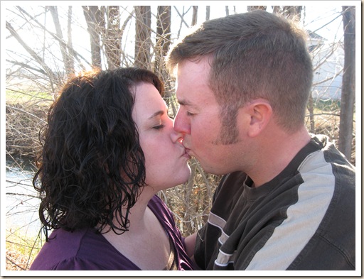
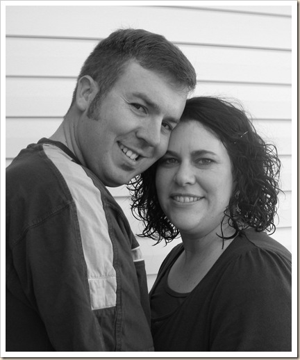
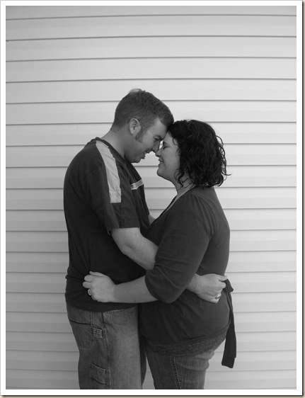
A friend of mine received my Relief Society white elephant service gift at Tuesday night’s quarterly enrichment activity and quickly cashed it in. She had taken pictures for her sister-in-laws engagement and I was asked to help make the wedding invitations. Lucky for me, I got to learn on the job. These were some of the pictures "C" took and how we tweaked them to get the final product.
Then I had some fun with Photoshop. Maybe a little too much fun… Nah!
Soft and faded. Looks all glowy, like a fairy-tale kiss in the park.
Soft and tinted. Fluffy, isn’t it? Then it was bippity-boppity-boo time and about five hours later came up with this and several, very similar versions. I’m sure by tomorrow evening I’ll have three more completely different layouts.
Of course the names, dates, times and places have been changed, but there’s the final (or at least one of a couple) choices the bride and groom can choose from.
I’ve already spotted a few fixes… but I’m not changing the faux blog display. Patience & Practice. So what’dya think???? To use another Randy Pausch quote,
"When you are doing something badly and no one’s bothering to tell you
anymore, that’s a very bad place to be. Your critics are the ones still telling
you they love you and care."


December 12, 2008 at 12:45 PM
Looks great! You should hold a Photoshop seminar...I could use some lessons.
December 12, 2008 at 8:45 PM
Once again you amaze me. I so need to invest in a better camera and equipment(I almost have JP up for it, it is between that or Rock Band...I wonder which one will win). You are awe inspiring!